
 Step 0: Defining Goals
Step 0: Defining Goals
Before any work can be done, I find it important to define my objective clearly, so that all design and implementation decisions can be made in reference to the overarching goal of the project.
Objective: Create a website to help students visualize and understand the scientific developments that contributed to our current understanding of the atomic model.
Intended Audience: Junior year high school students at the Trumbull Alternate School.
Client: A chemistry teacher at the Trumbull Alternate School.
Step 1: Concept
After goals are defined, I like to begin the web design process with pen and paper. It helps me identify and address design challenges quickly.
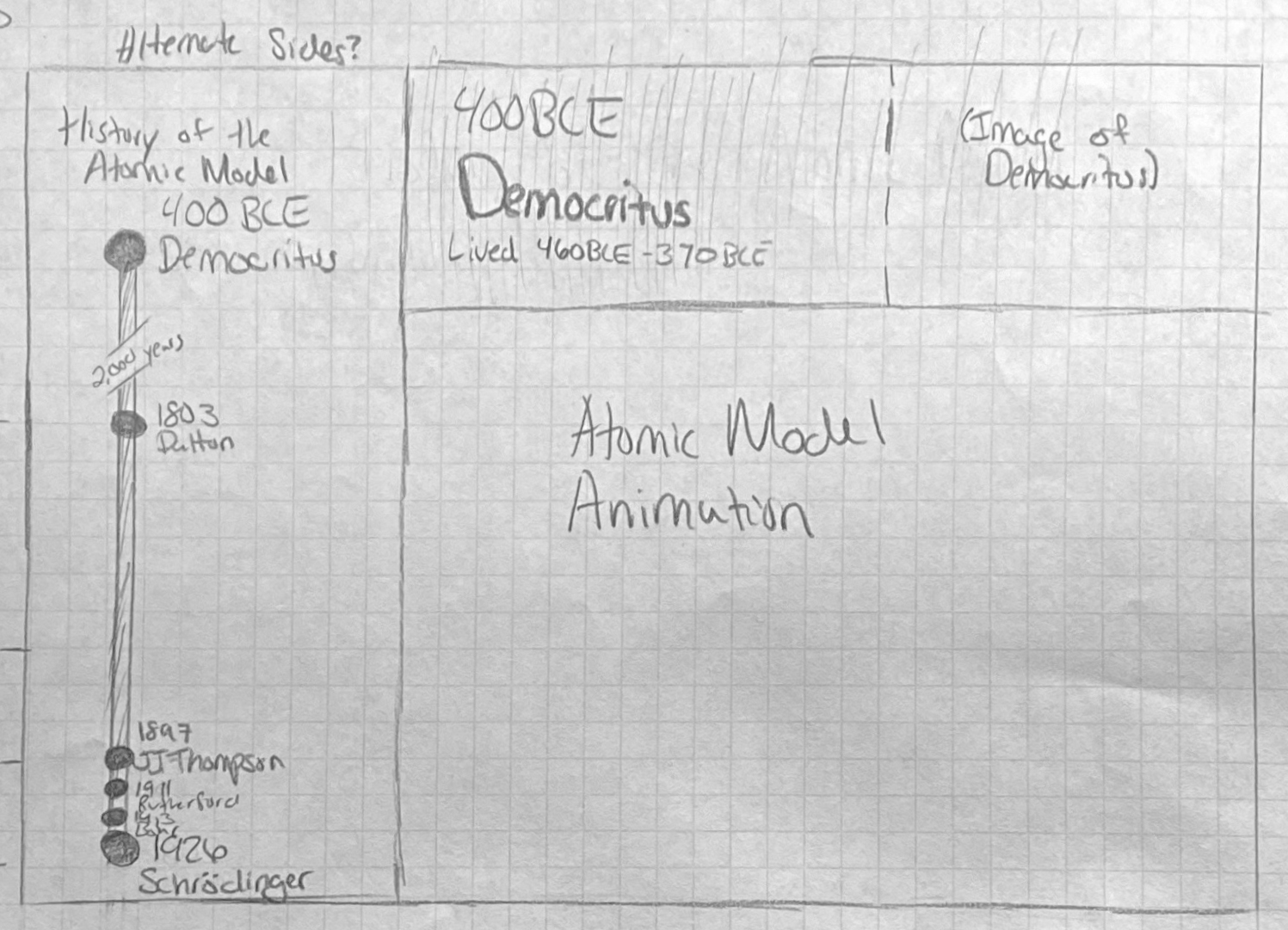
An early drawing of the web app layout.
ChemTAS.com’s ultimate goal is to help students visualize and comprehend how we got to our current understanding of the atom. Towards this end, I brainstorm a few ideas that could help students absorb the information more quickly and effectively.
First, I decide on a two-column layout. Crucially, this contains a timeline element on the left, to help students visualize the time difference between the earliest scientific developments and the latest ones. This information is kept adjacent to each article, making it easier for students to understand where the article they are currently reading fits into the broader scope of the website.
Additionally, a vibrant, unique color is chosen to represent each scientist throughout the entire website. Associating a color with each concept creates a mnemonic device, assisting students in memorizing the core content of the articles.
During this early concept-defining process, I decide on the centerpiece for this entire web application – a large animation depicting the various changes to the atomic model. I plan on making it appear when users change the article they are viewing. The animation will dynamically change to showcase the developments that occurred between the discovery the student is currently viewing and the discovery the student wishes to view next. This is intended to orient students in time. To accomplish this, I will use Lottie, a Javascript library developed by Airbnb for displaying and controlling an SVG animation in the browser.
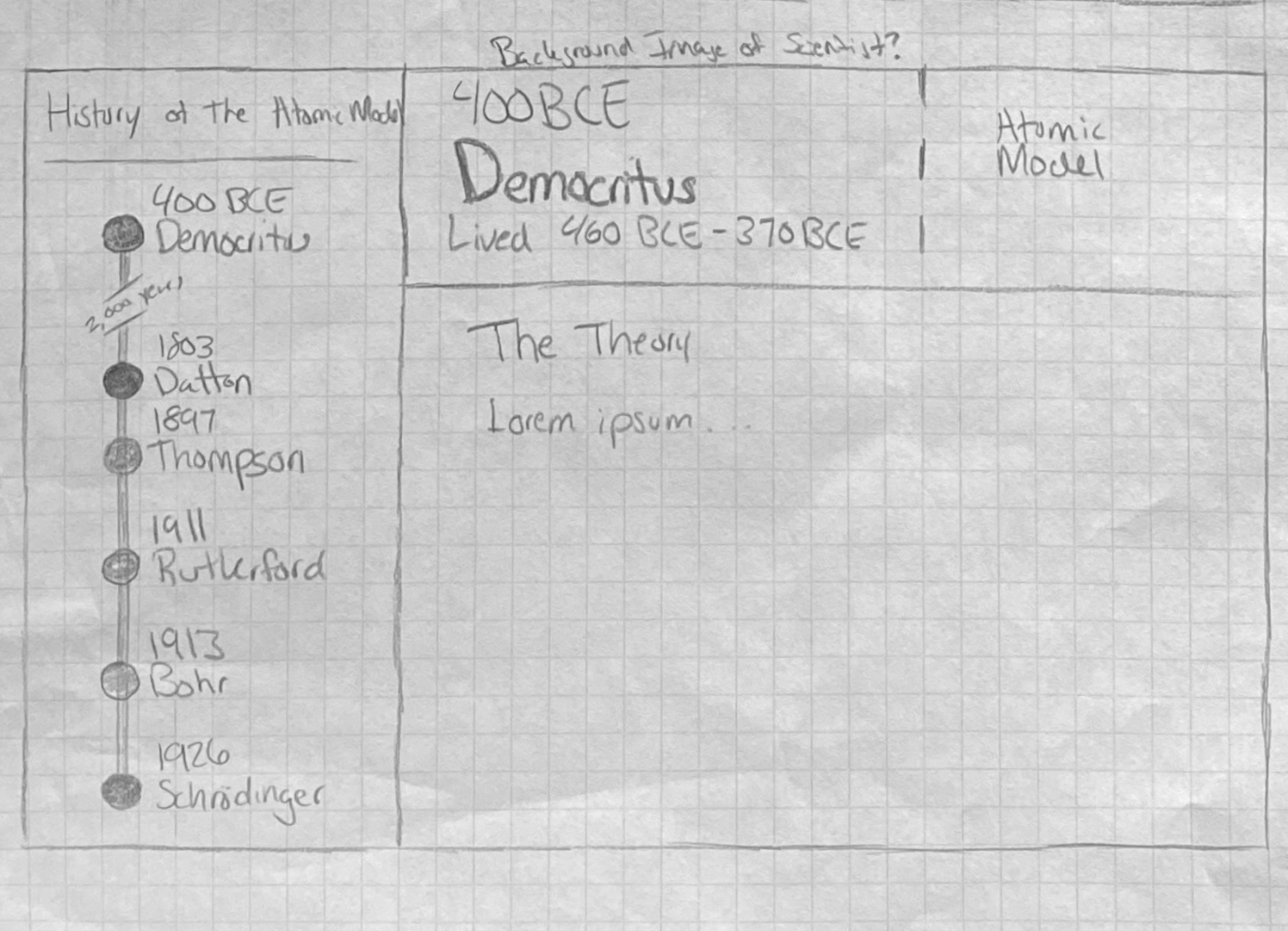
A revised drawing of the web app.
After sketching, some design problems become apparent, and I start drawing out some potential solutions.
Most significantly, I notice that the timeline on the left could not be done to scale in the browser, especially considering the tiny screen sizes of mobile devices. The spread out timeline would be condensed vertically, and the 4 most recent developments would lack the space to be clearly laid out and would overlap each other significantly.
This presents a significant problem, as the timeline is intended to visually present the gaps in time between scientific developments – especially the explosion of discoveries in the 29-year period from 1897 to 1926.
The solution I sketch out includes a break in the scale of the timeline, specifically in the 2000-year gap between Democritus’s and Dalton’s contributions. This change allows the remaining nodes to be roughly to scale, with a bigger gap between Dalton and Thompson than there is between Rutherford and Bohr. The timeline now fits nicely within the browser, and still serves as a proper visual aide for students.
During this stage, a few changes are also drawn in the right side of the website, where the main articles are. While the modifications here are minor, they go on to inspire crucial components of the final product. This is one of many reasons why I advocate for beginning any design process on pen and paper. Rapid experimentation often breeds good, creative ideas that profoundly change the final product.
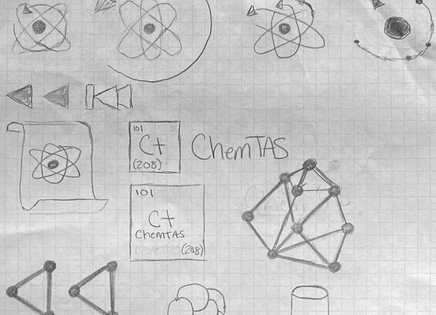
ChemTAS logo sketchbook.
I also decide that the ChemTAS logo itself needed an update. The previous logo had its time, but the project is due for a more simple and recognizable mark.
In a field as old as chemistry, all basic logo concepts have already been used to represent companies for many decades. My goal, however, is to create a logo that combines the unique characteristics of this website, while also invoking chemistry as a topic.
Towards this end, I sketch out ideas as quickly as they come into my mind. Many of the concepts are left in the sketchbook, but the most promising ones move on to the wireframing stage.
Step 2: Wireframing
After the concepts are solidified, it becomes time to test if they translate well to the screen. In this wireframing process, I seek to weed out design flaws and precisely measure elements for the implementation process later.
An early mockup of ChemTAS.com
I start by replicating the most promising sketch in Adobe Experience Design.
Just by displaying the concept sketch more precisely on the screen, I can quickly recognize strengths and weaknesses that I am less able to identify on paper.
I feel this design’s strengths primarily root in the overall layout of the page. The two-column layout is intuitive to use, and aids students in understanding how the article they are reading fits into the timeline as a whole. Also, the consistent color assigned to each discovery successfully groups ideas together, and makes the website easier to use.
With that said, this first draft requires a mountain of work before production.
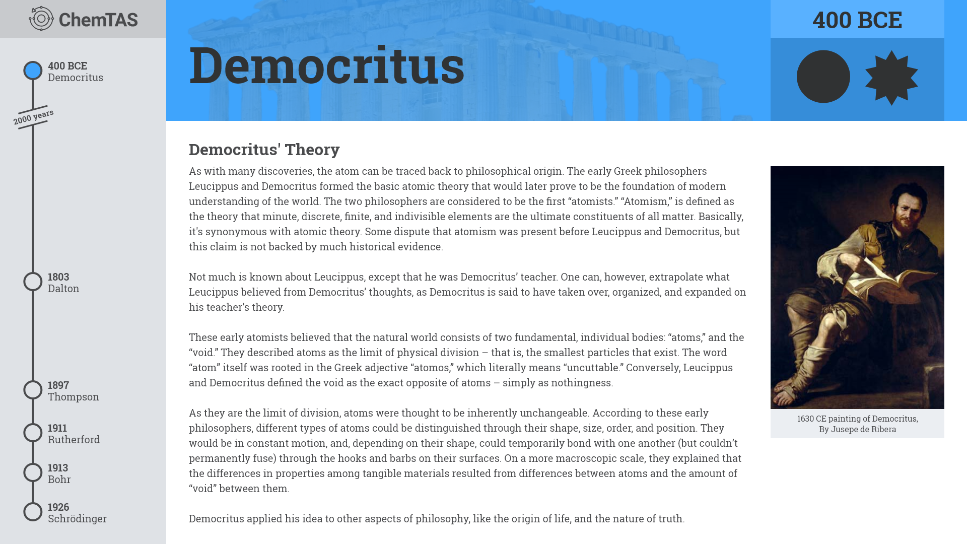
First and foremost, this iteration has obvious visual hierarchy problems that need to be addressed. Ideally, users’ eyes are guided from element to element in a way that results in their overall understanding of the page layout. In this current design, my eyes wander from content to headings, to pictures, and back to content. This is confusing for the end user, and becomes a high-priority problem for me to fix. I set to work adjusting font colors, weights, and sizes to encourage a proper viewing order for users.
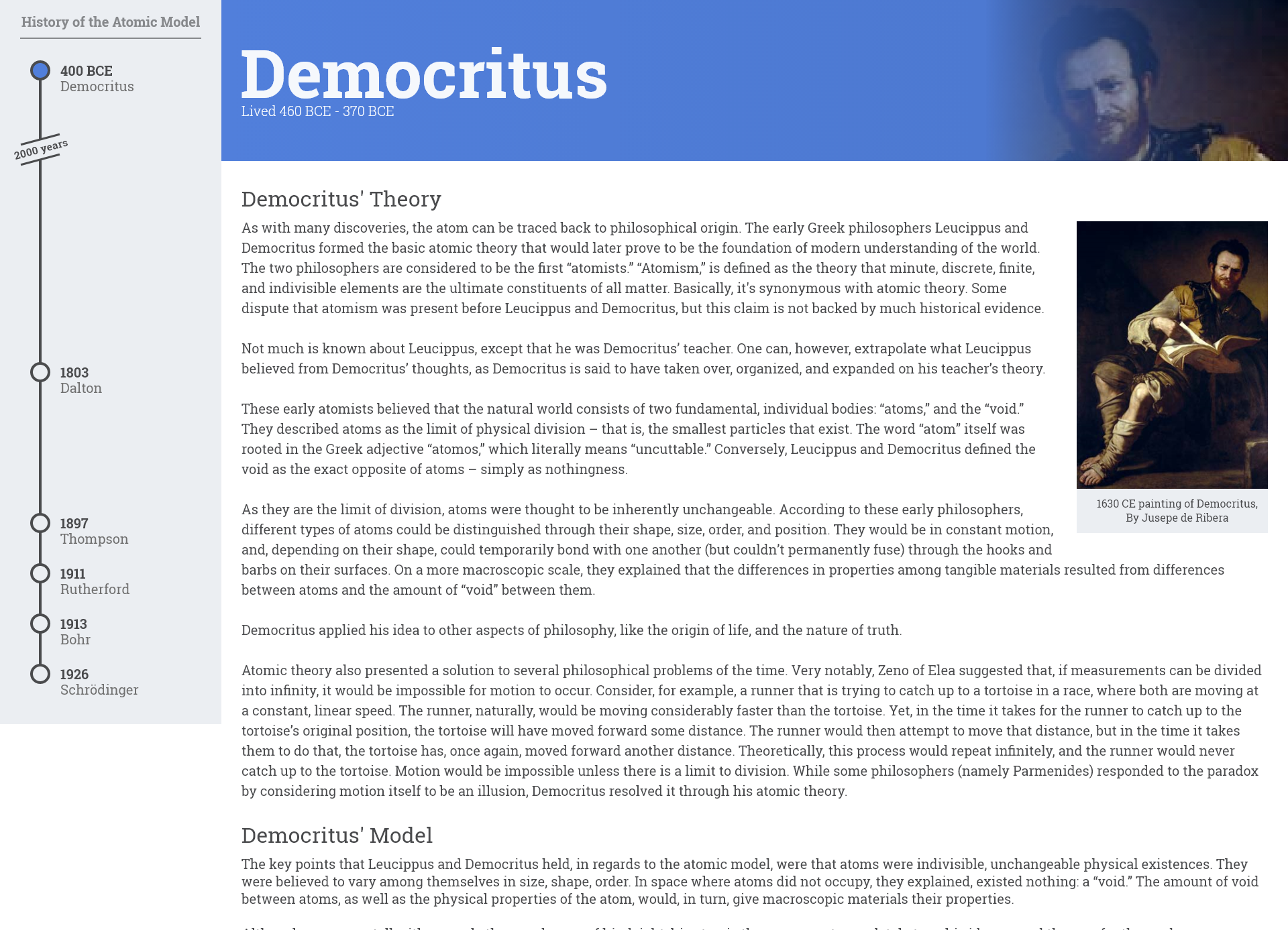
Another major problem that becomes apparent to me is how forgettable the flat, bland design of the page appears. The dull design of the page works against our target audience – students seeking to remember the content. To work towards a solution to this problem, I add a semi-opaque photo to the background of each article’s header, representing a scene the scientist had likely witnessed during their lifetime. Each photo has its background removed using Adobe Photoshop, so the unique color corresponding to the scientist is able to shine through. This helps personify the scientists in each article, and adds a memorable element to the page that breaks up the otherwise flat design. To this same end, I also increase the size of images and non-text elements.
These are just two of the many problems I address during this wireframing process. I work on issues like alignment, consistency, and cohesiveness before the final wireframe is created.
A few mockups of logos.
With the wireframe mostly complete, I begin to mock up the most promising logos from my sketchbook. I digitally recreate quite a few, building off ideas until I end up with a small selection of logos that I like the most.
Among the logos I experiment with, my favorites all end up incorporating the same concept: a rewind symbol combined with an atomic model. I feel these logos combine the unique properties of this ChemTAS project in a memorable and recognizable way.
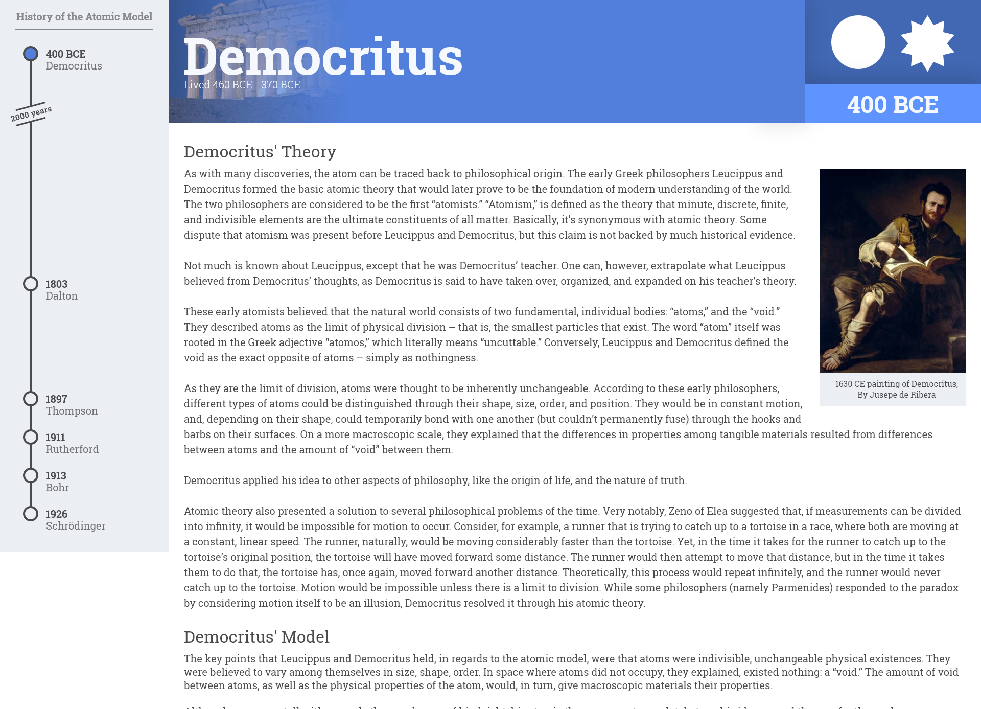
My overall favorite among these quickly becomes the bottom right in the image above. The atomic model used in this logo is the “Bohr” model, which is still used today in the classroom to explain properties of electrons in atoms. The outlined style of this mark is also indicative of a sketch, which I feel nicely represents the process of discovery that is so central to the project.
The final logos for consideration.
After the mark was finalized, I need to accompany it with the project name, so its appearance can be linked to the actual website. I experiment a bit with fonts, and eventually decide on the bottom logo from the above iamge.
The final wireframe of the ChemTAS Landing Page.
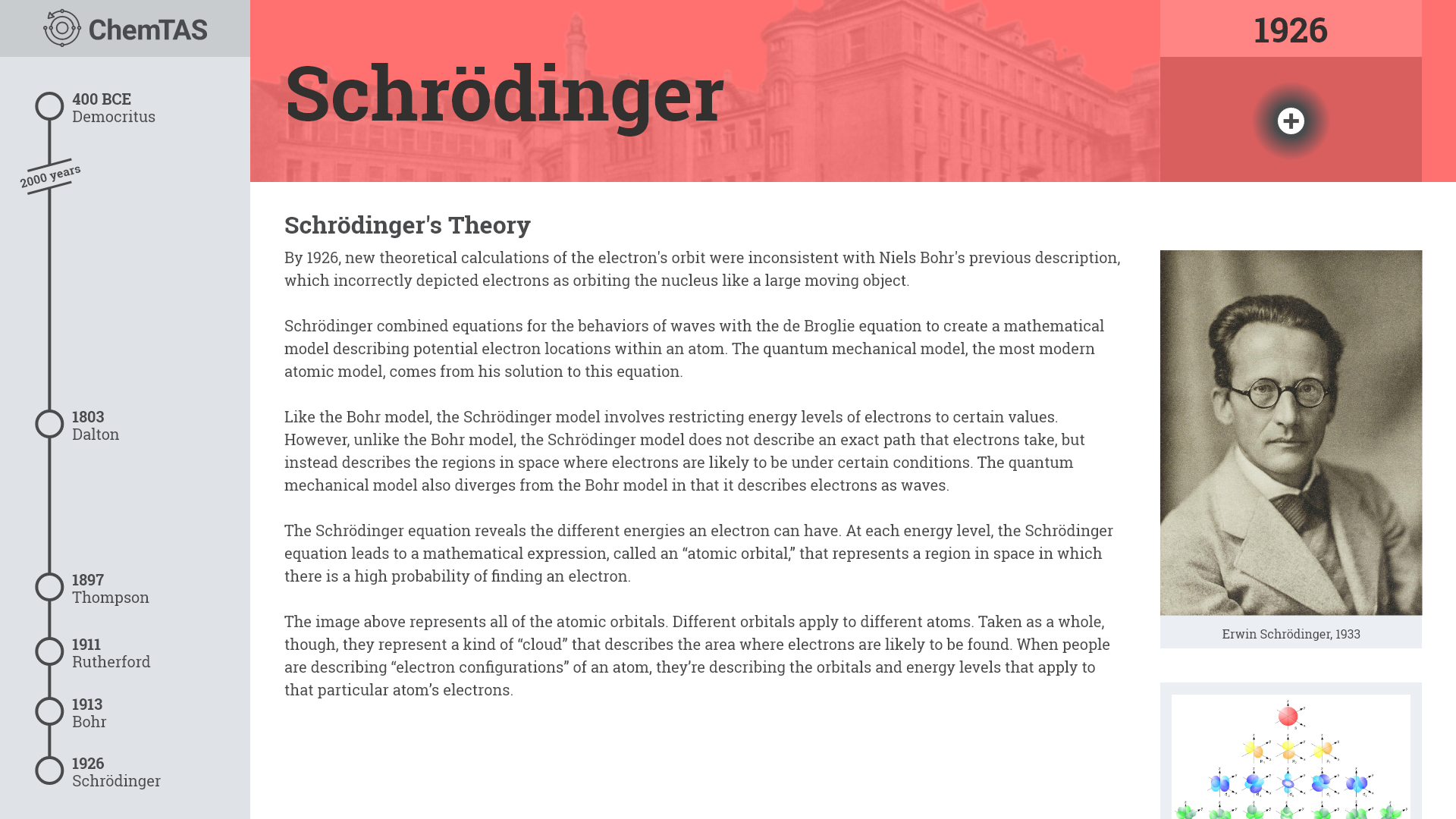
After many hours of experimentation with both the logo and the overall website design, I created this as the final wireframe.
Despite all the work that has already gone into the design phase of this project, it is missing the centerpiece! The dynamic atomic model animation would serve as the most crucial component of this project, and would take significant development time to fully implement.
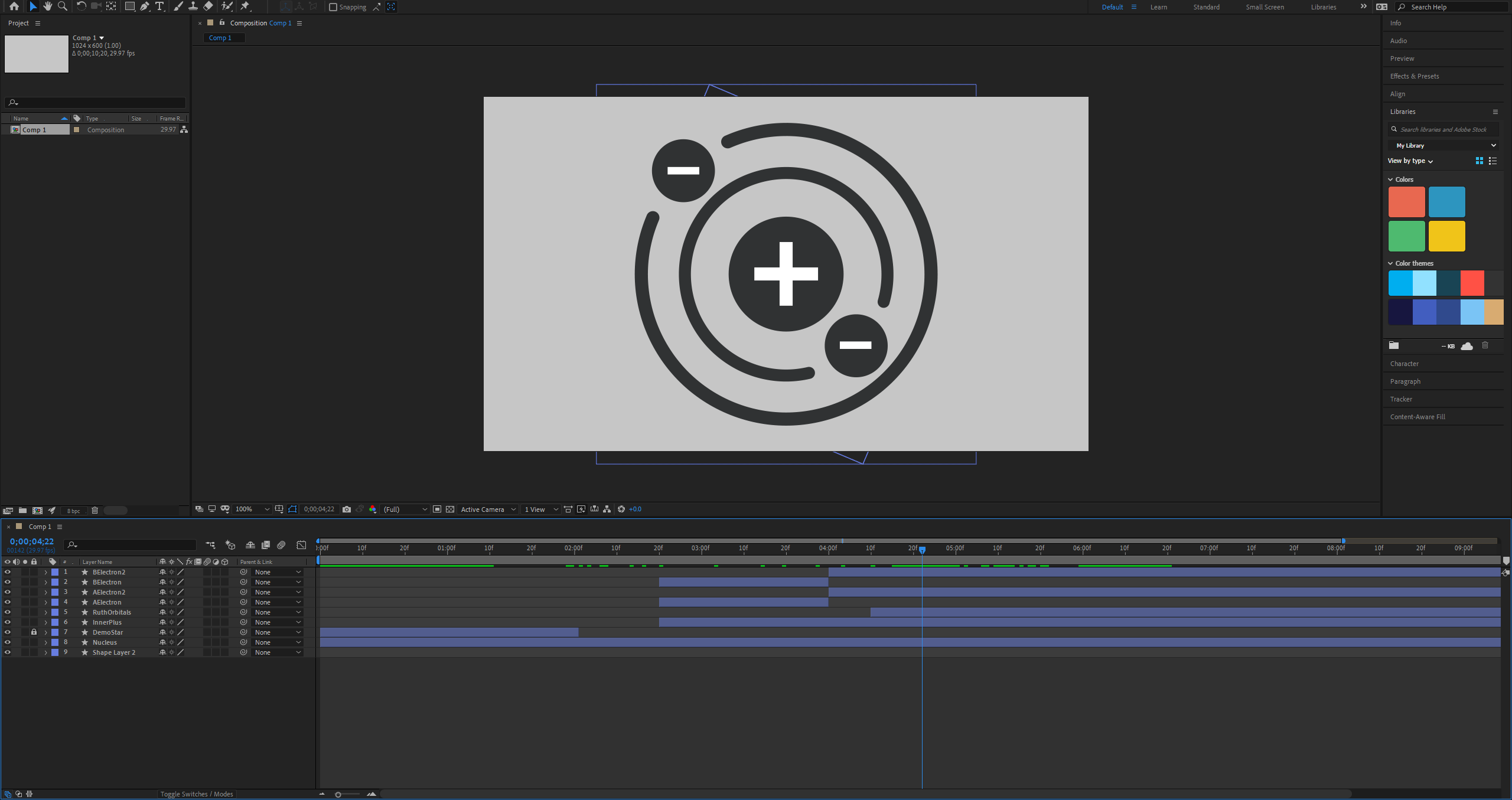
The Adobe After Effects animation process.
The first step in this process is to sketch out each atomic model loosely in Adobe Illustrator. This serves as a foundation during the animation process. From this base, I build the animation in Adobe After Effects, from Democritus’s to Schrödinger’s atomic model, stopping briefly after each development along the way. I finally export the animation data using Bodymovin, and it is ready to be implemented in the next step through Lottie.
With the majority of assets and design decisions made, it was time for the most important step in the wireframing process: applying these design concepts to a smaller device.
Most major aspects of this project’s design scale down quite easily. However, adapting the left timeline to mobile proves especially troublesome. It scales poorly when either vertical or horizontal screen size is decreased. This is a significant design challenge, but it is solved by several vertical and horizontal CSS breakpoints.
Aside from this major issue, there were a few minor problems that were solved relatively easily, such as the atomic model in each article’s header. It was able to easily be brought down to the article’s main content on small screen sizes.
The iPad scaled design.
The iPhone scaled design.
With the iPhone and iPad design complete, it is time to finally develop the product!
Step 3: Implementation
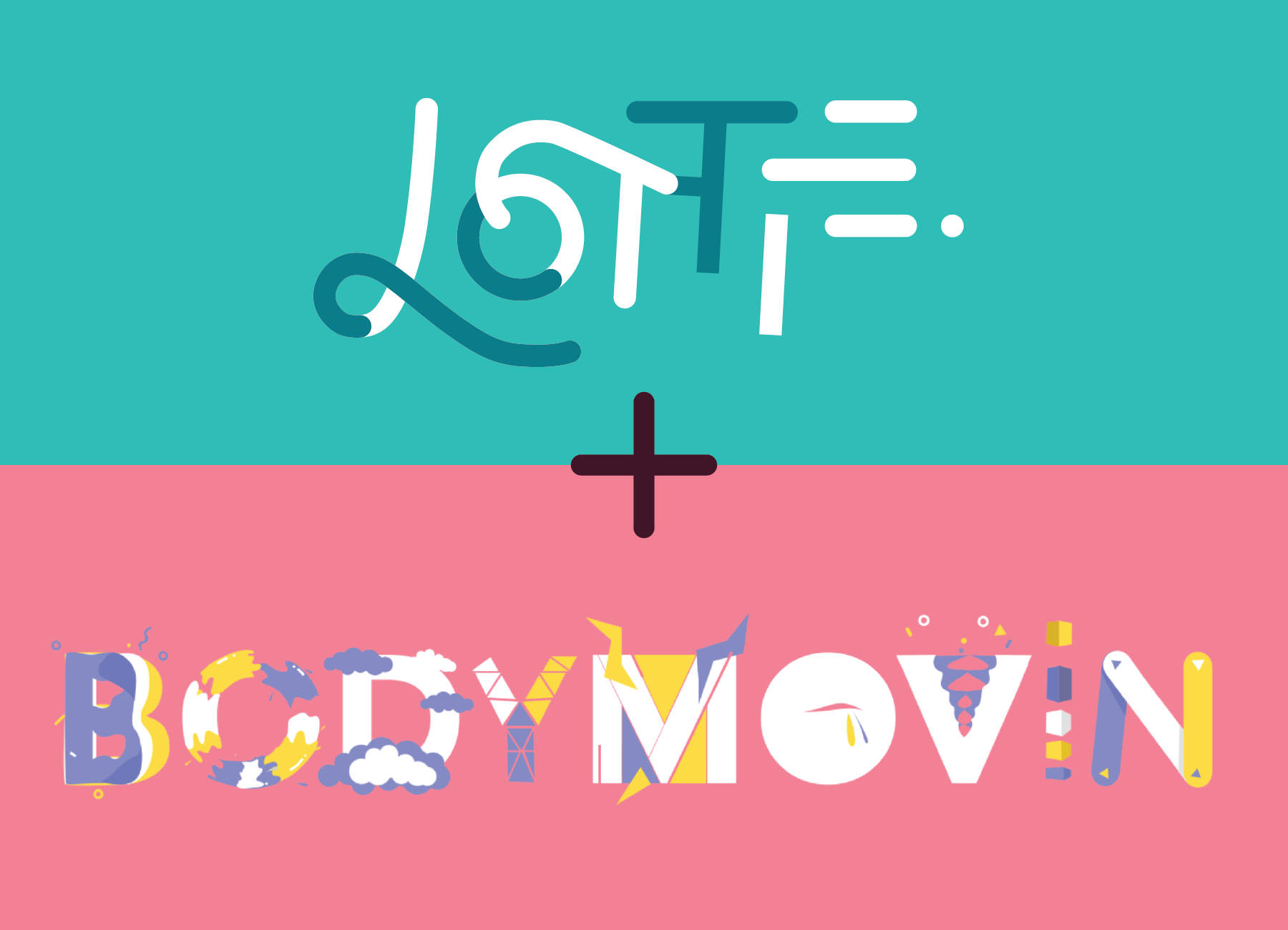
Lottie and Bodymovin.
With all my web projects, I like to use SASS rather than vanilla CSS. It keeps my projects more clean and concise. I store my essential SASS variables in a _vars.sass file, and for this project I choose to store component styles in separate files: _components.sass and _componentsresponsive.sass..
Relying on the wireframes and my experience with SASS and CSS, I lay out this project’s styles quickly and smoothly.
The centerpiece of the website, however, proves to be a difficult implementation challenge. I begin by rereading Lottie’s documentation. After understanding the Javascript library’s capabilities, I separate the larger challenge into smaller, more manageable tasks:
- Determine the timestamp where each scientist’s portion of the animation starts and ends.
- When the user selects an article, determine the entire portion of the animation that should play based on step 1.
- Determine if the user is going forwards or backwards in time. If the user is going backwards, reverse the start and end timestamps and play the animation in reverse.
- If the user clicks on the currently selected article, exclusively play that scientist’s portion of the animation.
By breaking this problem into chunks and planning out my code on a whiteboard, I efficiently tackle this implementation challenge.
With this, the project is complete! All that remains is to document and publish my code.
Step 4: Reflection
After finishing each of my projects, I like to reflect on what went well and what did not, in order to improve my practical programming ability for the next project.
Overall, I am quite proud of how this project turned out. It has proven to be a valuable resource for Trumbull Alternate School students, and the client has been very happy with how it has positively impacted her classroom.
Defining this project’s goals early, and forcing myself to justify each design and implementation choice relative to this central goal helped me to maintain my focus on the user experience. Elements of the design such as the two-column layout and the dynamic SVG animation work towards the overarching goal of the project in a meaningful way.
With that said, I also discovered some flaws in my process that I will correct in future projects. This is how I have grown as a developer.
First, I began to understand the value in a mobile-first design process. The mobile form factor is generally the most restrictive and the lack of screen space makes designing layouts more difficult. In this project, I designed the desktop version first, and worked towards shrinking the design concept down to a mobile format after. Per this method, if the design does not fundamentally scale down to mobile very well, I would have to make broad changes to already designed elements. This wastes development time. It should be far easier to first work through the most difficult design problems presented by a mobile format, and scale this mobile-friendly design up to a larger screen.
Additionally, I learned about WCAG accessibility guidelines and how to properly implement them to a website. It is my responsibility as a designer and developer to make websites accessible and usable for as many people as possible. I will absolutely adhere to this responsibility in future projects.
Overall, I enjoyed creating this new resource, and I would love to do more educational work like this in the future. It is awesome to know that students are actively using this as a useful learning tool throughout their Chemistry courses. That makes the work feel meaningful, and all the effort worthwhile.
