
 Step 0: Defining Goals
Step 0: Defining Goals
With all of my projects, I begin by defining my goals. By clearly outlining the objective of the project, I can more easily make design and implementation decisions later on.
Objective: Create a webapp that allows creatives to create and organize color swatches for their projects.
Intended Audience: Graphic designers and digital artists.
Step 1: Concept
After defining the project’s goals, I begin the design process by quickly sketching out concepts. By drawing with pen and paper, I can quickly iterate on my designs, solving problems as I go.
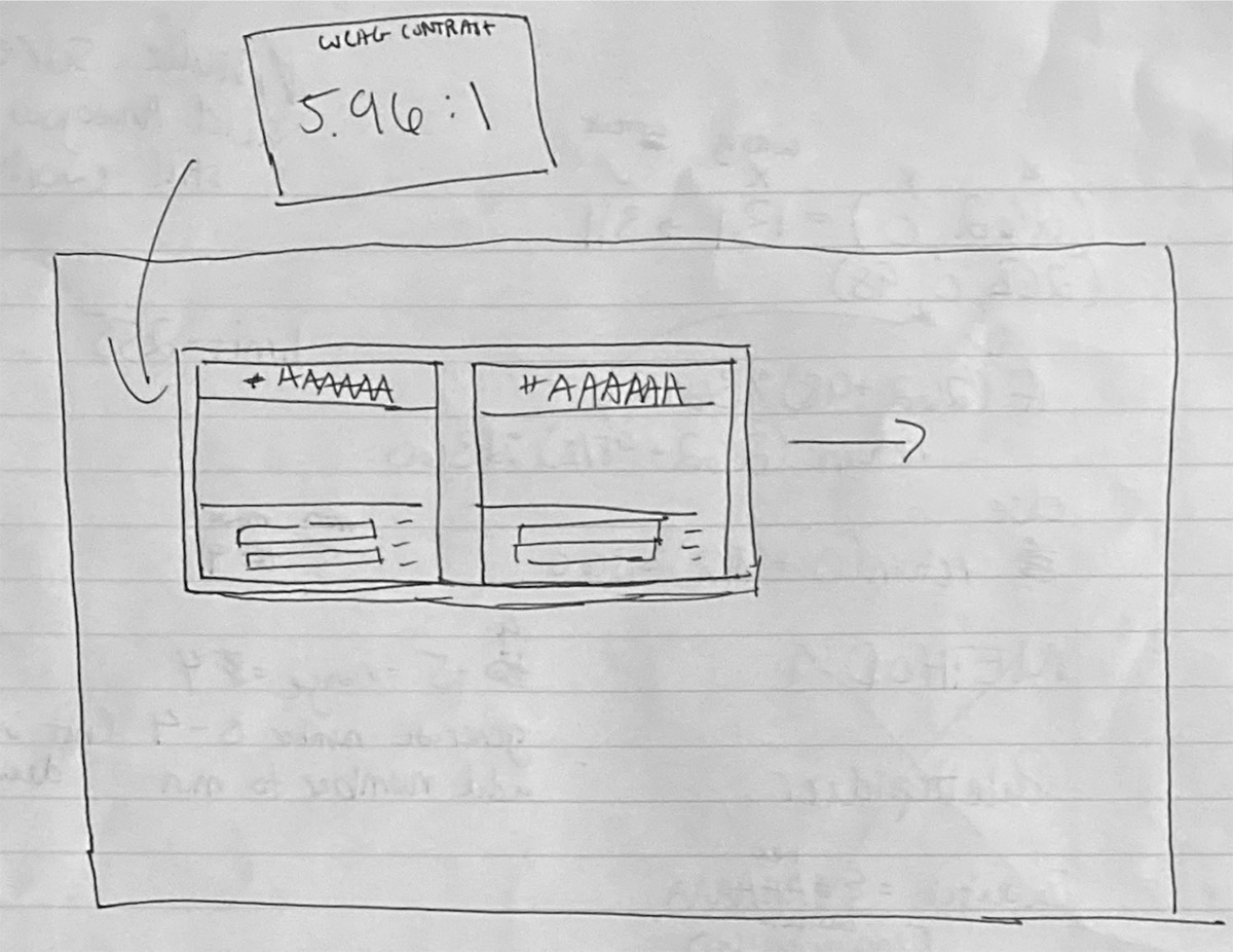
A quick sketch of the tile layout for the contrast widget.
Guided by the overarching goals of the project and my own experience as a designer, I begin to list the essential features of the project.
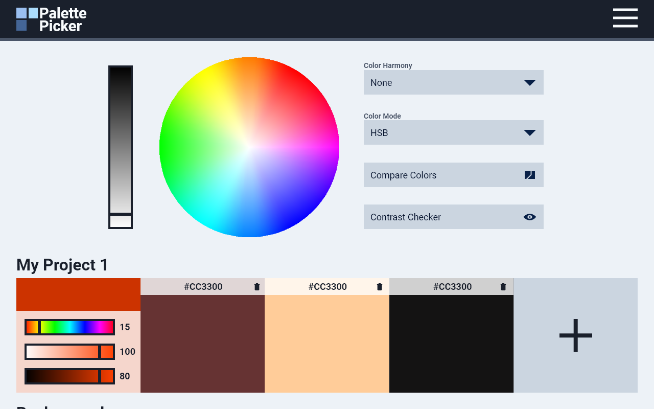
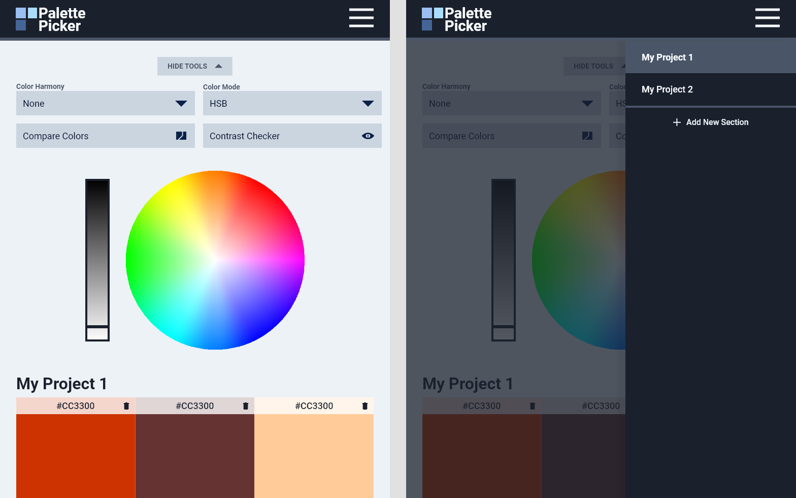
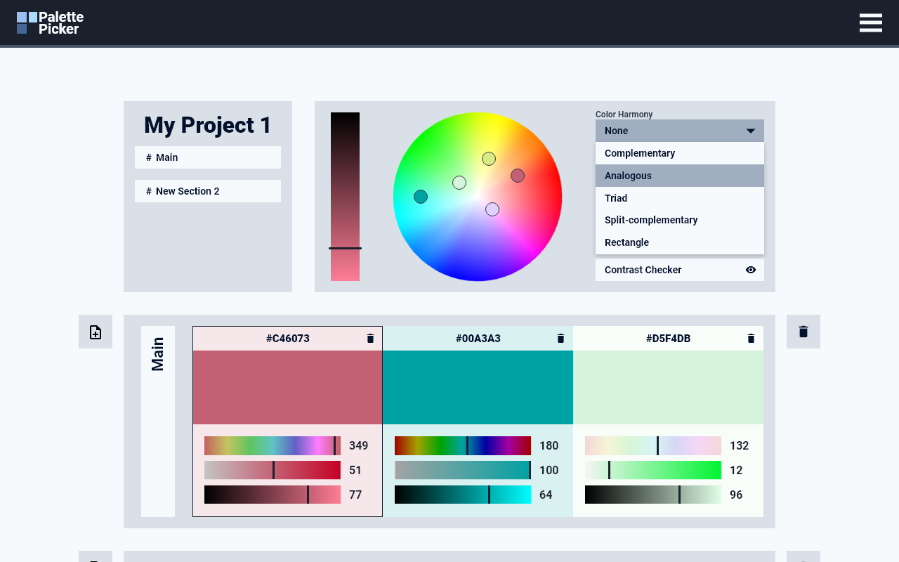
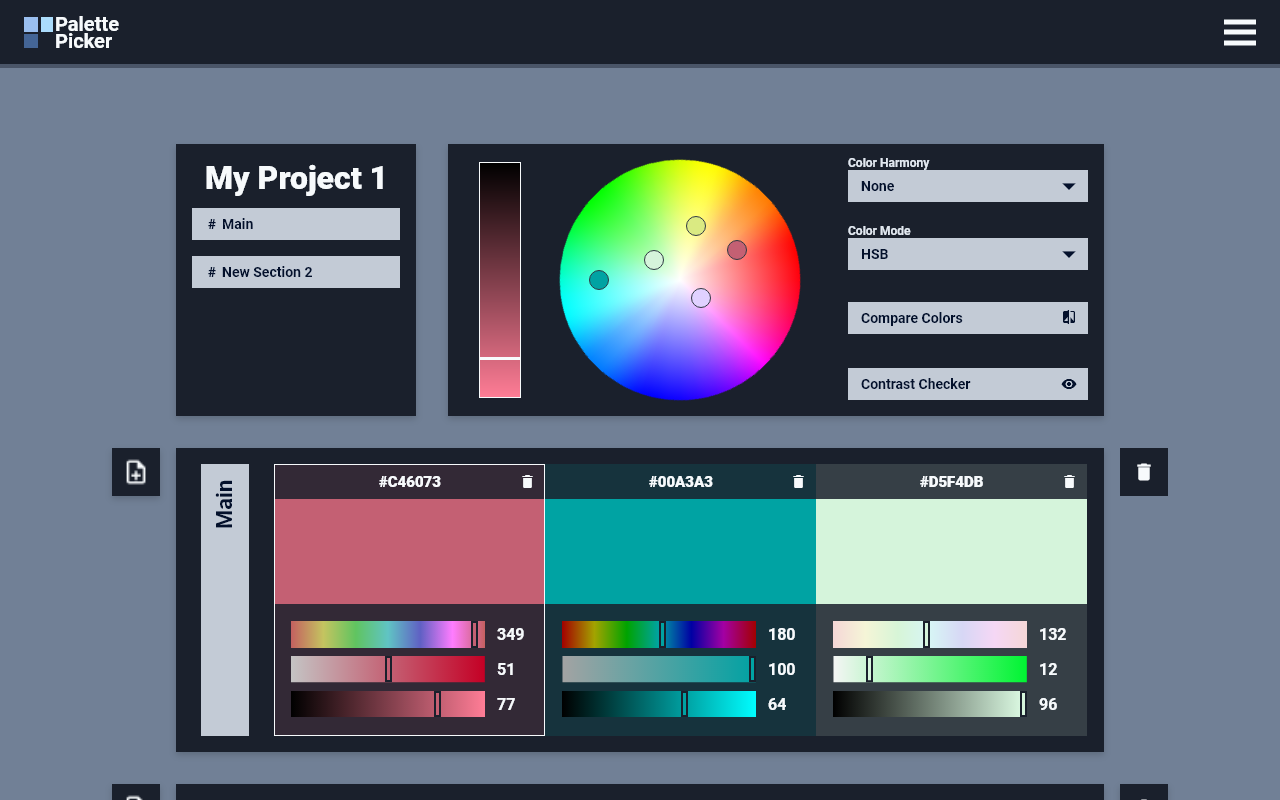
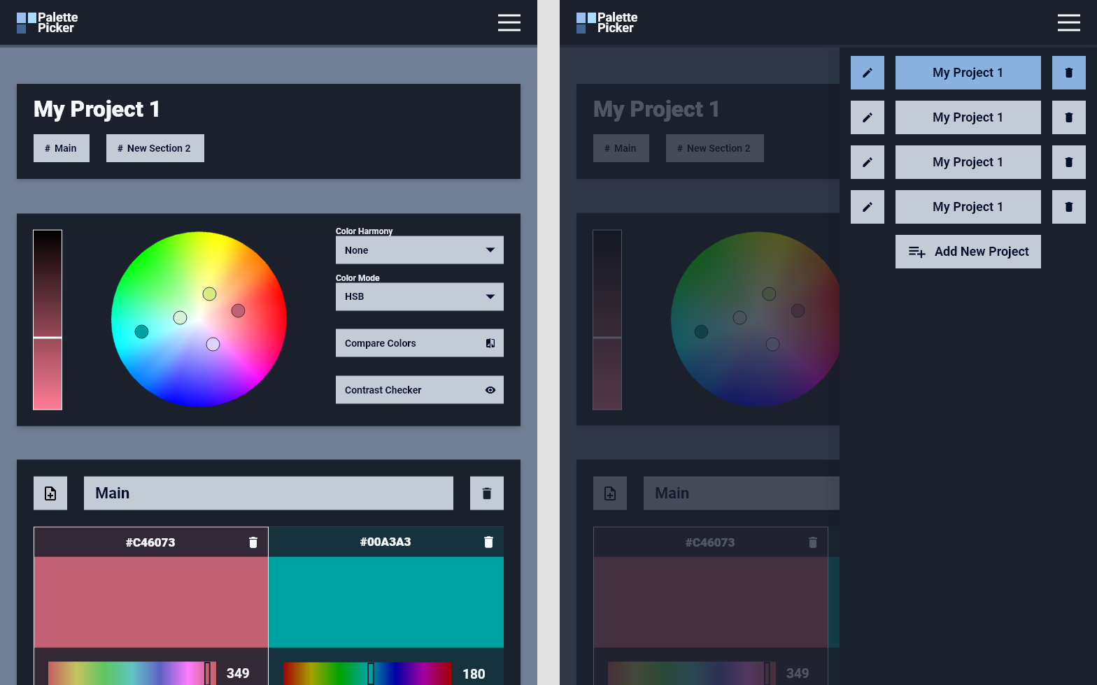
First and foremost, the project must allow users to easily select, save, and organize swatches. Designers and artists using the webapp should be able to visually select a color, and save it within subsections of the page to further organize it.
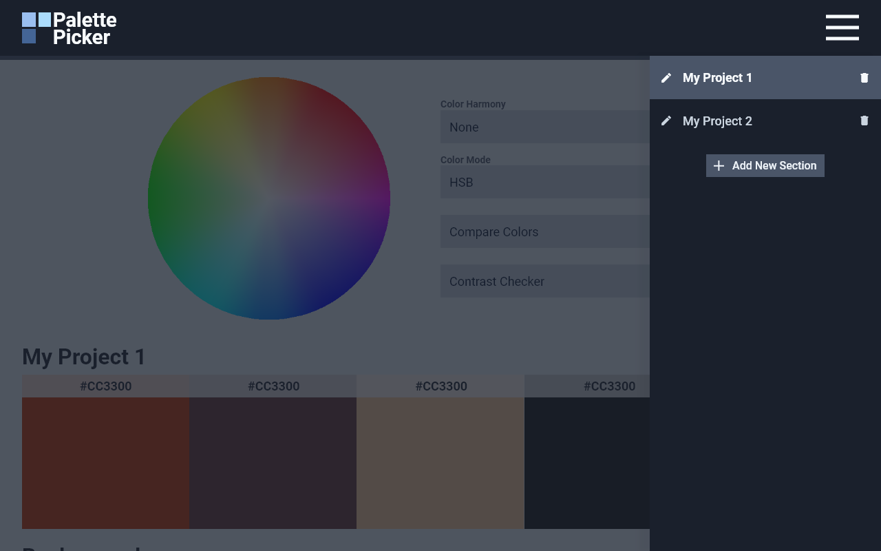
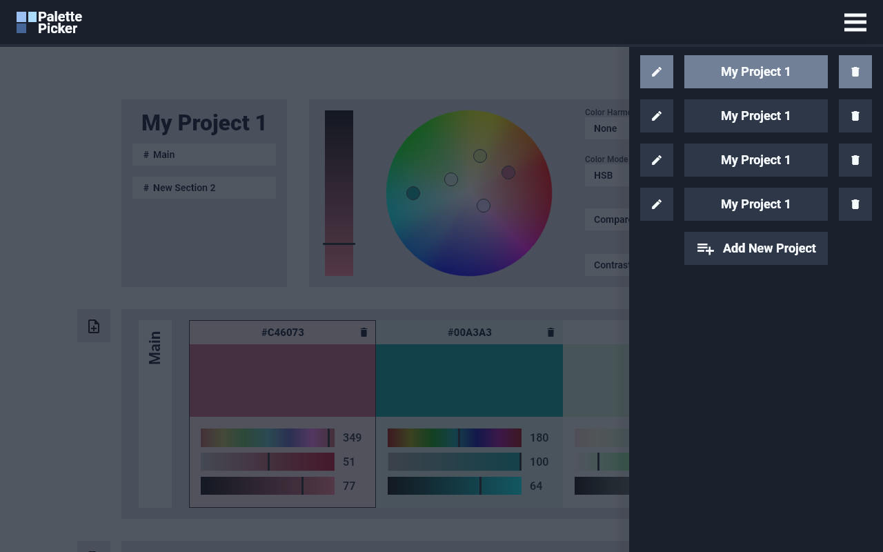
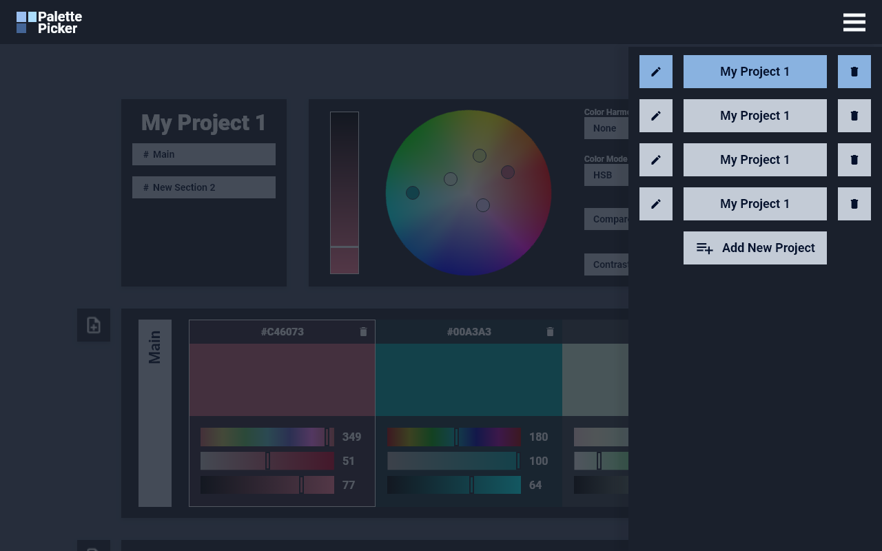
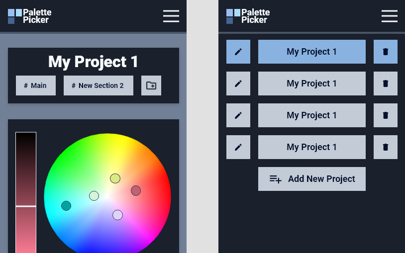
This webapp’s primary audience frequently works on multiple projects at once. To keep swatches organized, ThePalettePicker must allow users to create entirely different projects, and toggle between each workspace. Each project should be saved locally in the browser, so users can return to previous work.
Designers and artists also tend to work on a wide variety of mediums. Each medium, however, tends to primarily operate in a unique color space. CMYK, for example, is particularly useful for designers of print media. Color modes like this all have their own use case, and this webapp’s users should be able to convert between the most common ones: HSB, HSL, RGB, CMYK, and HEX.
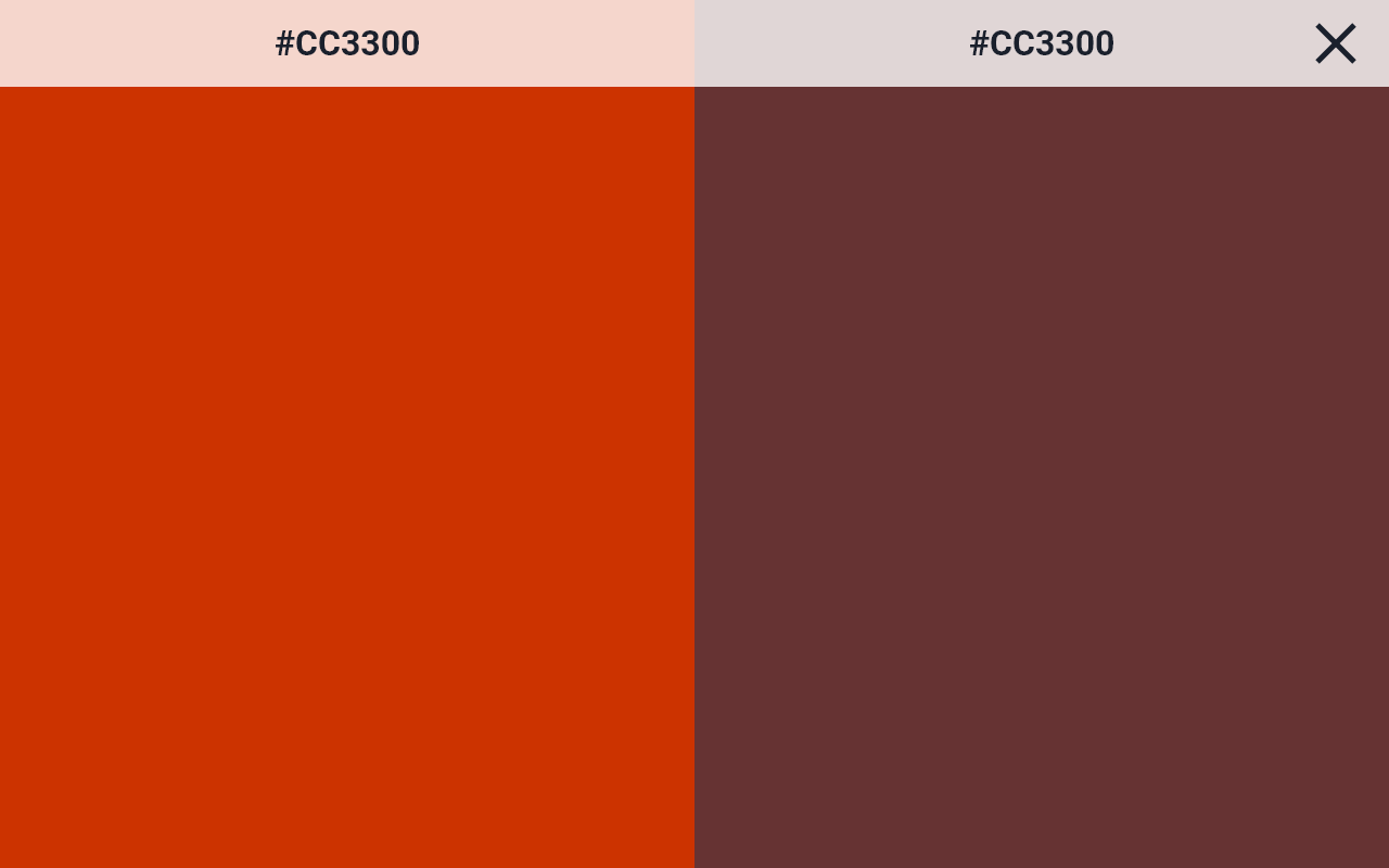
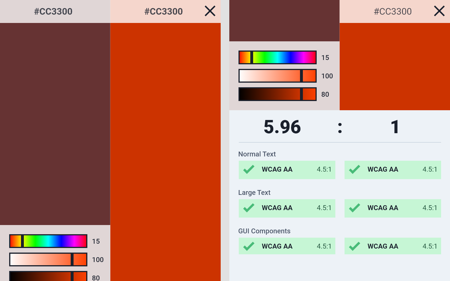
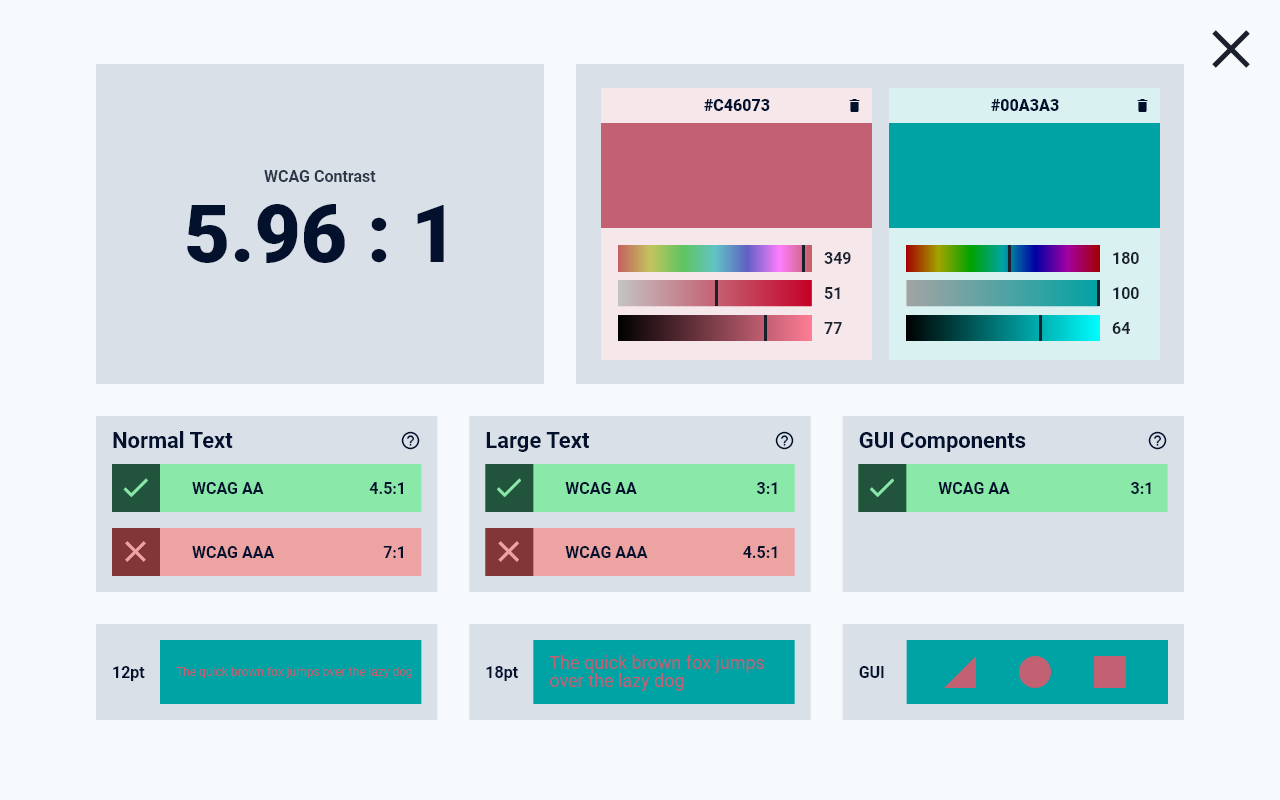
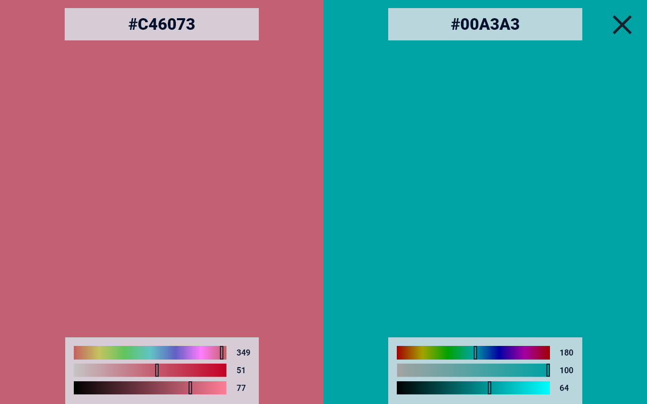
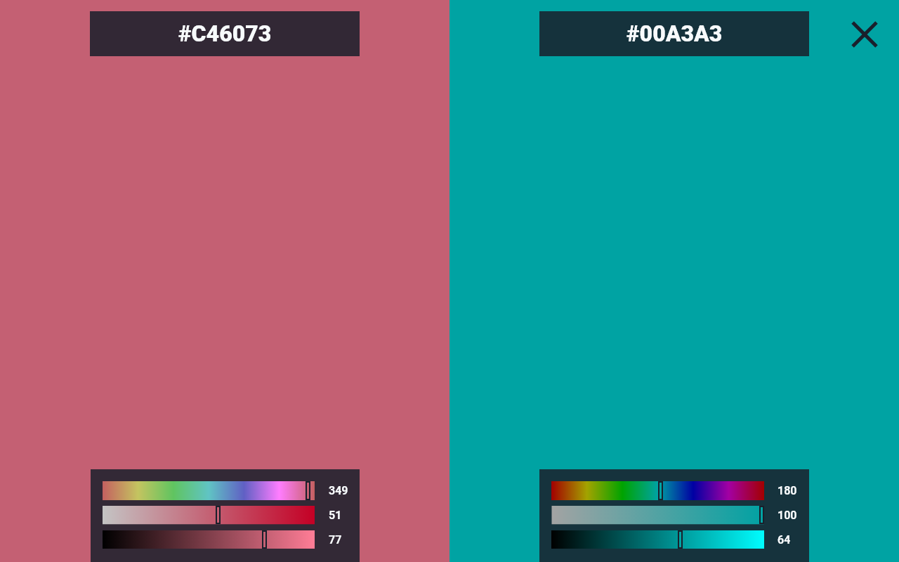
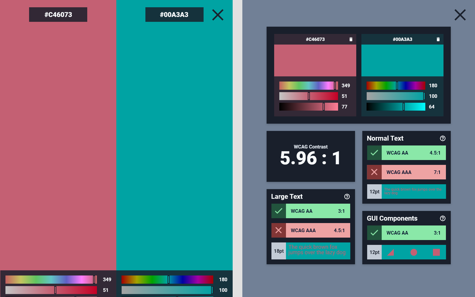
As users expand their library of swatches, it becomes difficult to view and compare individual colors. ThePalettePicker should include a widget that allows users to select two colors and view them in a large format, where they can be easily evaluated.
In addition, designers and artists alike often require a basis for their art – some inspiration to guide their own projects. Towards this end, ThePalettePicker will allow users to quickly create color schemes using various color harmony rules. Through the complementary, analogous, triad, split-complementary, and rectangle color rules, users of this webapp can quickly bootstrap their projects with colors that mathematically compliment each other.
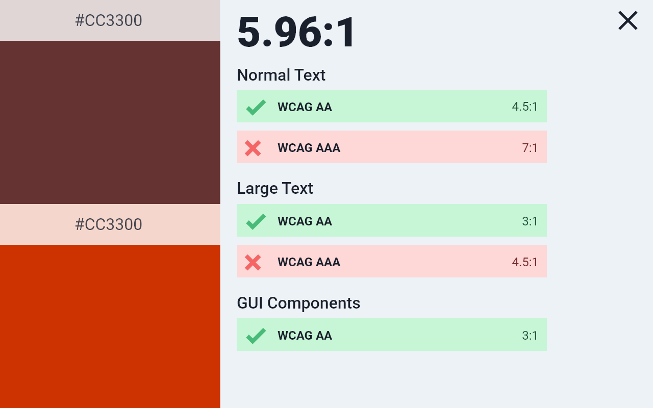
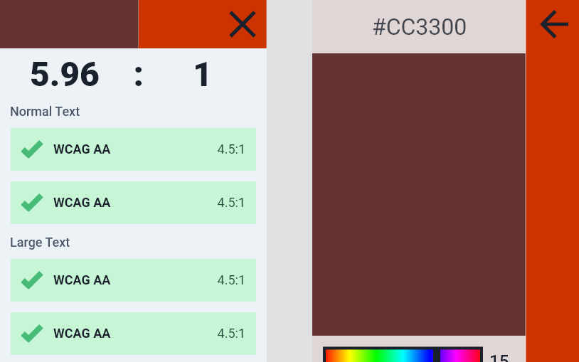
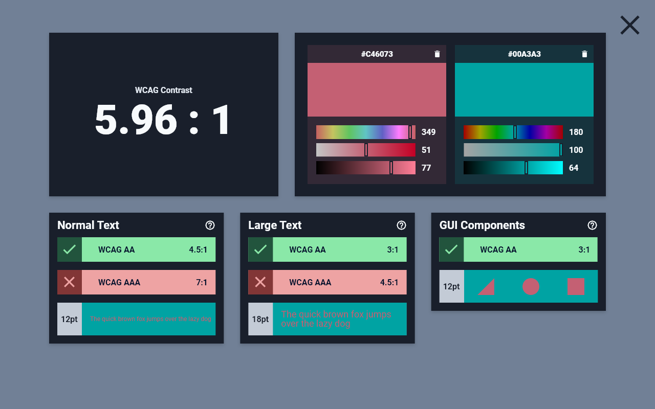
A subset of ThePalettePicker’s intended audience, designers of interactive digital media, require a very unique feature – the ability to easily conform to accessibility guidelines. From a legal, technical, and moral standpoint, accessibility is mandatory in modern interactive digital media. The Web Content Accessibility Guidelines (WCAG) define the standards that designers and programmers must implement. To this end, ThePalettePicker will include a widget that displays the WCAG contrast ratio, as well as AA-level and AAA-level compliance, between any two colors in the user’s palette.
Altogether, these features make this one of the most ambitious personal projects I have undertaken. This list and the accompanying sketches will guide design and development as I work towards the first version of this webapp.
Step 2: Wireframing
After defining the main features and sketching out possible designs, I move forward into the wireframing stage. In this stage, I seek to correct design flaws and precisely place elements on the page for the implementation process later.
The first draft of ThePalettePicker’s desktop wireframe.
After hours of iteration, I arrive at a stopping point – the first draft of this project’s design. While I recognize this design is flawed in its current state, instead of developing it further with my own vision, I look to a more accurate method of improving the user experience: user tests. I ask a few friends that fit in my target audience for their opinion and perspective on the design. I track their needs and how quickly they can find the features that fit them. These user tests reveal some significant flaws that would need to be worked through.
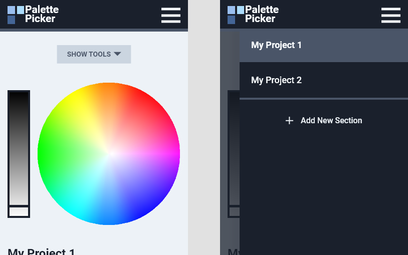
First, users report that the webapp does not clearly distinguish between the topmost tools and the swatches at the bottom of the page. Users feel disoriented in the page, as the line between built-in tools and swatches they have personally selected is unclear. I solve this in the next iteration by redesigning the overall layout into tiles, giving greater definition to the tools in the header. This change also solves several additional design problems presented in this first revision, and makes the design more easily adapt to a mobile layout.
Second, users report that they feel unclear as to where they are in the webapp. The active project is not visually different than the rest of the subsections, and blends in with the content of the page. In the next iteration, I move the active project’s name into its own component in the tile-based layout. Additionally, I move each section header into a more defined box, which distinctively groups it with its corresponding content.
Third, users report that the order in which they view the text on the page is not conducive to an overall understanding of the webapp. The jarring differences in each text’s weight and size leave the user looking around the entire app for the most basic of functionality. I fix this by defining and implementing a strategy for scaling text of different types in the next revision.
In addition to these three issues, users report some minor grievances that impact how they process and use the app. These concerns would all be addressed in the second draft of ThePalettePicker’s wireframe.
The second draft of ThePalettePicker’s desktop wireframe.
Considering all user feedback, I finish the second draft of the ThePalettePicker wireframe. Then I begin the second round of user testing.
Based on user feedback, this design iteration performs significantly better than the first draft. Users comprehend each feature’s purpose and understand the webapp more easily.
With that said, there is one key point that some users had difficulty with: the contrast between some of the lighter grays and their background. Especially on displays without exceptional color reproduction, some users need to squint to see the background of individual components – a huge design and accessibility problem. To solve this, I completely overhaul the color scheme of the webapp.
The final draft of ThePalettePicker’s desktop wireframe.
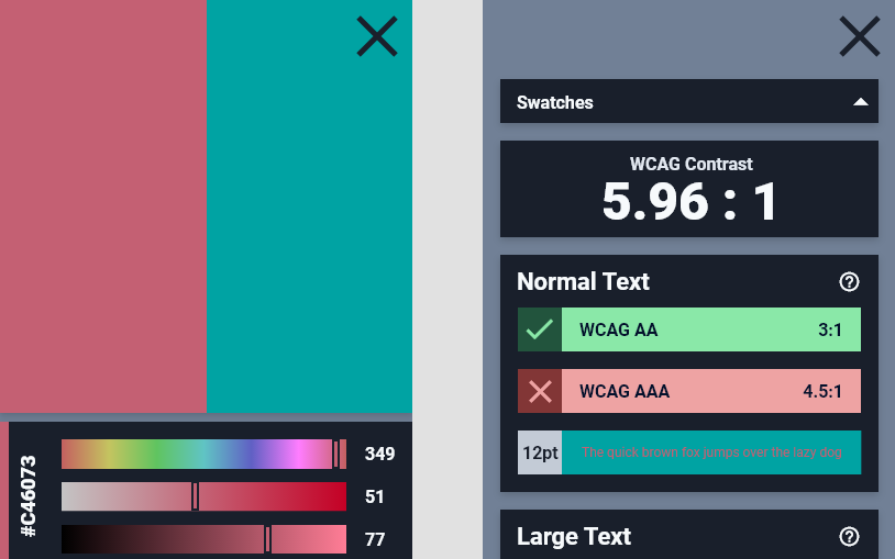
In this final revision, I entirely revamp the color palette of the project itself. Most notably, the contrast between the dark background of each component and the interactive elements on the page now surpasses the WCAG AAA standard for accessibility. Not only does this assist with visually impaired users, but it allows users with full vision to more clearly understand the page at a glance.
In addition, some minor sizing and content changes are included.
This final iteration also includes a refined mobile design. By bundling the functionality of the webapp into individual components, the design shrinks to small form factors easily. While some minor changes are necessary to adapt to smaller screens, this process overall goes smoothly.
After this long, meticulous design process, I begin to finally feel confident in the result. With that said, while I consider this the “final” design, I always keep an open mind and address user feedback, especially in production!
Step 3: Implementation
With the feature list complete and the wireframe finalized, I can finally move on to my favorite development phase – implementation! As this is my most ambitious personal project, this phase would be certain to be riddled with fun and interesting challenges to conquer.
The first step I take in the implementation phase is always planning. I start with the technology stack I intend to use and work towards a refined programming plan and organization scheme.
React.js
The first dependency decision I reach is by far the most important – deciding between React.js and vanilla Javascript. After considering both options, I decide that React.js is particularly suited for this single page webapp, and would decrease development time significantly. The only significant downside of the technology is a slightly increased loading time. I evaluated this drawback to be negligible after webpack optimizes the code.
In addition to React.js, I employ several packages that contain complicated algorithms that would otherwise be difficult to rewrite without bugs. This includes npm packages like color-convert, focus-trap-react, and natural-compare-lite. Color-convert in particular would prove to be the backbone of this project, as accurately converting between color spaces allows for the implementation of many must-have features.
As usual, I also use SASS rather than vanilla CSS to speed up styling.
For the first time, I elect to learn and use test driven development throughout the course of this project. This development strategy involves writing tests for code before writing the code itself, using tests to define the goals of each segment of the production code. This strategy should keep my code clean and concise, and keep this massive project organized in well-defined, testable functions. For the tests themselves, I use Enzyme and Jest.
With the technology stack and development strategy defined, I begin to work on the project’s individual challenges. Here are a couple of the notable and interesting ones.
The first challenge I will review involves the development of the large hue-saturation color wheel that makes the centerpiece for the entire project. I break this problem down into individual goals, that will eventually combine into a fully-featured component:
- The wheel must convert the x and y coordinates of clicks and drags within the color wheel into a hue measurement from 0 to 360, and a saturation measurement between 0 and 100. I solve this by using trigonometry to map the coordinates to colors.
- The wheel must display individual nodes based on the user’s swatches. The solution to this goal ultimately involves using the inverse function of step one, and displaying each node as a React.js component.
- The wheel must respond to click events by first determining which node the user intended to click on. I solve this by first determining if the user clicked within a certain number of pixels to any node, prioritizing nodes on the top of the stack. If this search yields no results, I edit the swatch the user already has selected.
- The wheel must update the corresponding swatch according to user interaction. This solution is very intuitive and involves calling a parent element’s method, updating the swatches.
- The wheel must respond to changes in its size, in order to adapt to all screen sizes well. This proves tricky, as the trigonometry involved in the majority of the wheel’s other features requires the circle’s radius. To work around this, I store the circle’s radius in the component’s state, and update it when the screen size changes.
With each of these goals addressed, the circle was complete!
The second challenge I will review involves making the project navigator accessible to keyboard interaction. For an accessible submenu like this, developers must programmatically control the focus of individual elements. While this is typically a simple process, the solution is ultimately not very “React-like,” as React.js does not typically want developers to directly access DOM elements.
To work around this, I use React.js’s refs feature to obtain references to a native element’s DOM node, and React.js’s forwardRefs function to allow the parent component control of the accessible functionality. Within the Nav component, I store each project’s DOM nodes, and use this to implement the necessary keyboard controls for WCAG compliance.
This same technique would be echoed several times throughout the project, maintaining accessibility as much as possible.
After solving these two problems and many, many more like them, the project is officially complete!
Step 4: Reflection
After completing any project, I like to reflect on what went well and what did not, as to improve my programming ability for the next adventure.
Overall, I am quite proud of how this project turned out. The final version contains over 9,300 lines of code over four languages. The sheer scope of this project required many weeks worth of work, but witnessing it come to fruition at the end was a pleasure.
Defining the goals of the project early, and reminding myself of them often, proved instrumental. It led to faster development and a more refined product.
Throughout the implementation phase of this project, I also learned the value of test driven development. By writing tests before code, I set up a defined condition for success and failure. This guided the development process, organized the code into testable components, and allowed for easy refactoring after tests eventually passed.
Also, I learned how to utilize a large code infrastructure, React.js, into my project’s specific needs. This library saved me thousands of lines of code, and its state-based design simplified the process significantly. This was the first significant project that I created using this tool, and I hope to have the opportunity to use it again in the future.
I learned another important lesson in the wireframing process. Based on user tests, the second revision of the wireframe was not conducive of a satisfying experience for those that struggle with sight. The following revisions made it easier for all users, even those with perfect eyesight, to understand and view the webapp.
I absolutely enjoyed creating this new resource. I see a few artists and designers already use it for their own projects, and it has proven to be an essential tool for my own projects as well. Witnessing others actually use the tools I create is one of the most rewarding aspects of working in this field. I look forward to developing projects like this in the future!
